Knowledge Graph Modeling:  Time Series Micro-Pattern Using gist

Knowledge Graph Modeling:  Time Series Micro-Pattern Using gist 

For any enterprise, being able to model time series is more than just important, in many cases it is critical. There are many examples, but some trivial ones include “Person is employed By Employer” (Employment date-range), “Business has Business Address”  (Established Location date-range), “Manager supervises Member Of Staff” (Supervision date range), and so on. But many developers who dabble in RDF graph modeling end up scratching their heads — how can one pull that off if one can’t add attributes to an edge?  

While it is true that one can always model things using either reification or leveraging RDF  Quads (see my previous blog semantic rdf properties) now might be a good time to take a  step back and explore how the semantic gurus at Semantic Arts have neatly solved how to  

model time series starting with version 11 of GIST, their free upper-level ontology (link below). 

First a little history. The core concept of RDF is to “connect” entities via predicates (a.k.a.  “triples”) as shown below. Note that either predicate could be inferred from the other, bearing in mind that you need to maintain at least one explicit predicate between the two, as there is no such thing in RDF as a subject without a predicate/object. Querying such data is also super simple. 

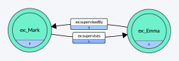
So far so good. In fact, this is about as simple as it gets. But what if we wanted to later enrich the above simple semantic relationship with time-series? After all, it is common to want to know WHEN Mark supervised Emma. With out-of-the-box RDF you can’t just hang attributes on the predicates (I’d argue that this simplistic way of thinking is why property graphs tend to  be much more comforting to developers).  

Further, we don’t want to throw out our existing model and go through the onerous task of re-modeling everything in the knowledge graph. Instead, what if we elevated the specific  “supervises” relationship between Mark and Emma to become a first-class citizen? What would that look like? I would suggest that a “relation” entity that becomes a placeholder for  the “Mark Supervises Emma” relationship would fit the bill. This entity would, in turn, reference Mark via a “supervision by” predicate while referencing Emma via a “supervision of” predicate.

Knowledge Graph Modeling: Time Series Micro-Pattern Using gist 

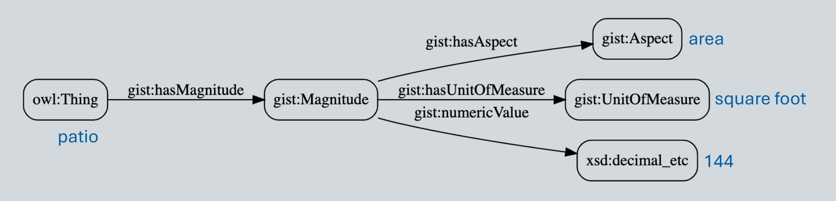
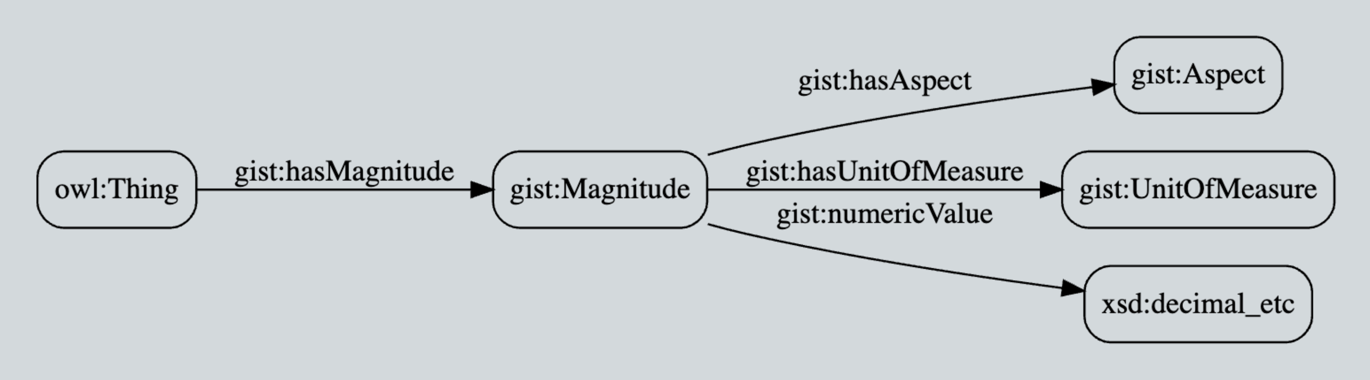
Ok, now that we have a first-class relation entity, we are ready to add additional time  attributes (i.e. triples). Well, not so fast! The key insight that in GIST, is that the “actual end date” and “actual start date” predicates as used here specify the precision of the data property (rather than letting the data value specifying the precision), which in our particular use case, we want to be the overall date, not any specific time. Hence our use of gist:actualStartDate and gist:actualEndDate here instead of something more time-precise. 

The rest is straightforward as depicted in the micro-pattern diagram shown immediately below. Note that in this case, BOTH the previous “supervised by” and “supervises” predicates connecting Mark to Emma directly can be — and probably should be — inferred! This will allow time-series to evolve and change over time while enabling queryable (inferred)  predicates to always be up-to-date and in-sync. It also means that previous queries using the old model will continue to work. A win-win. 

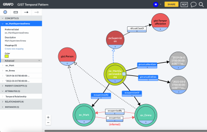
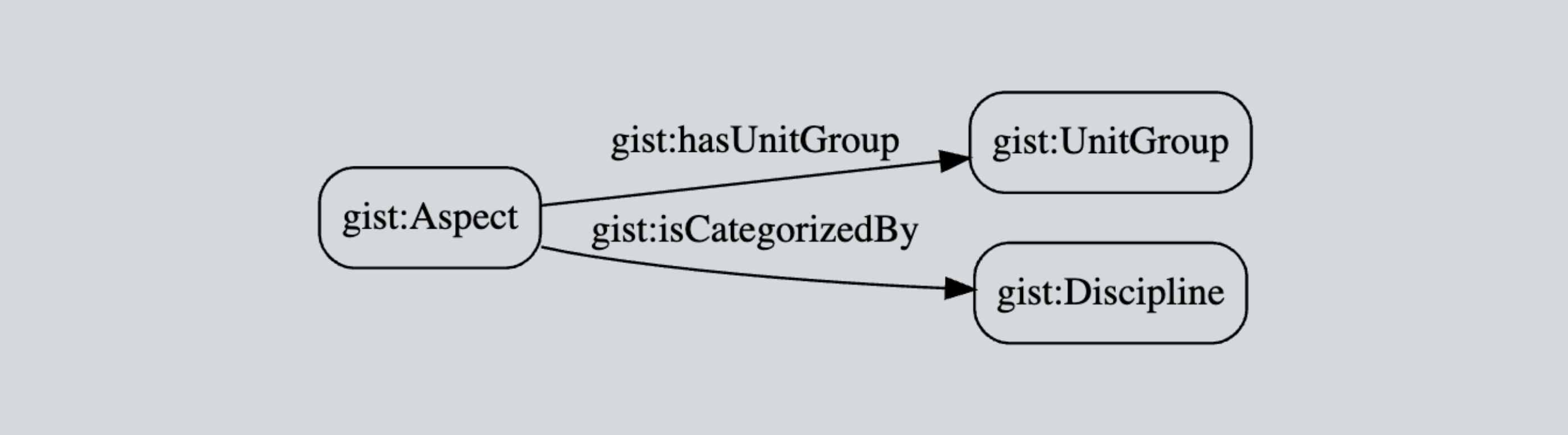
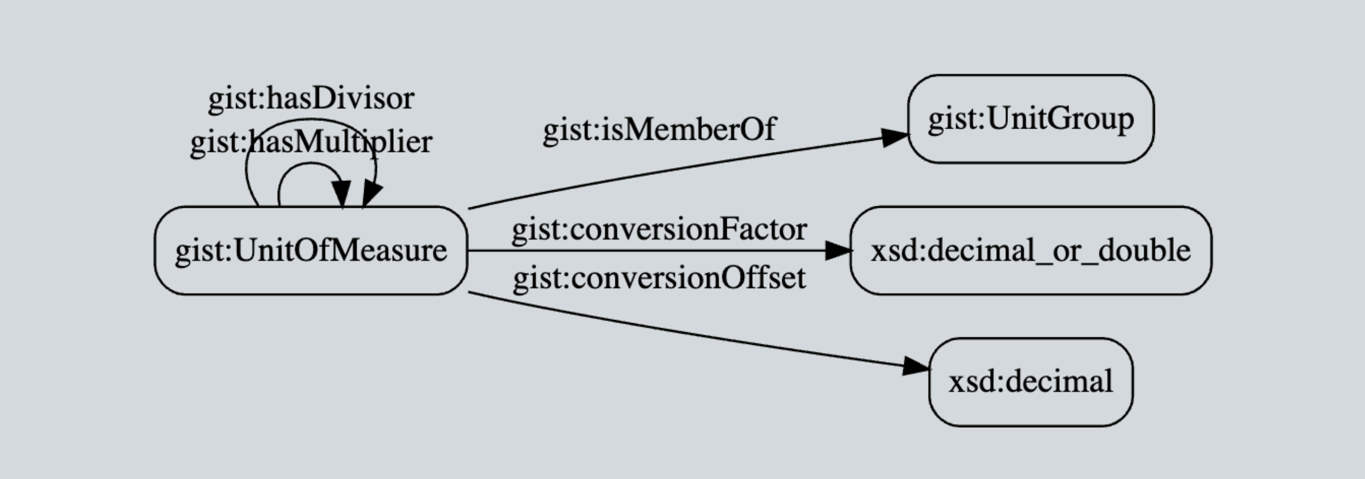
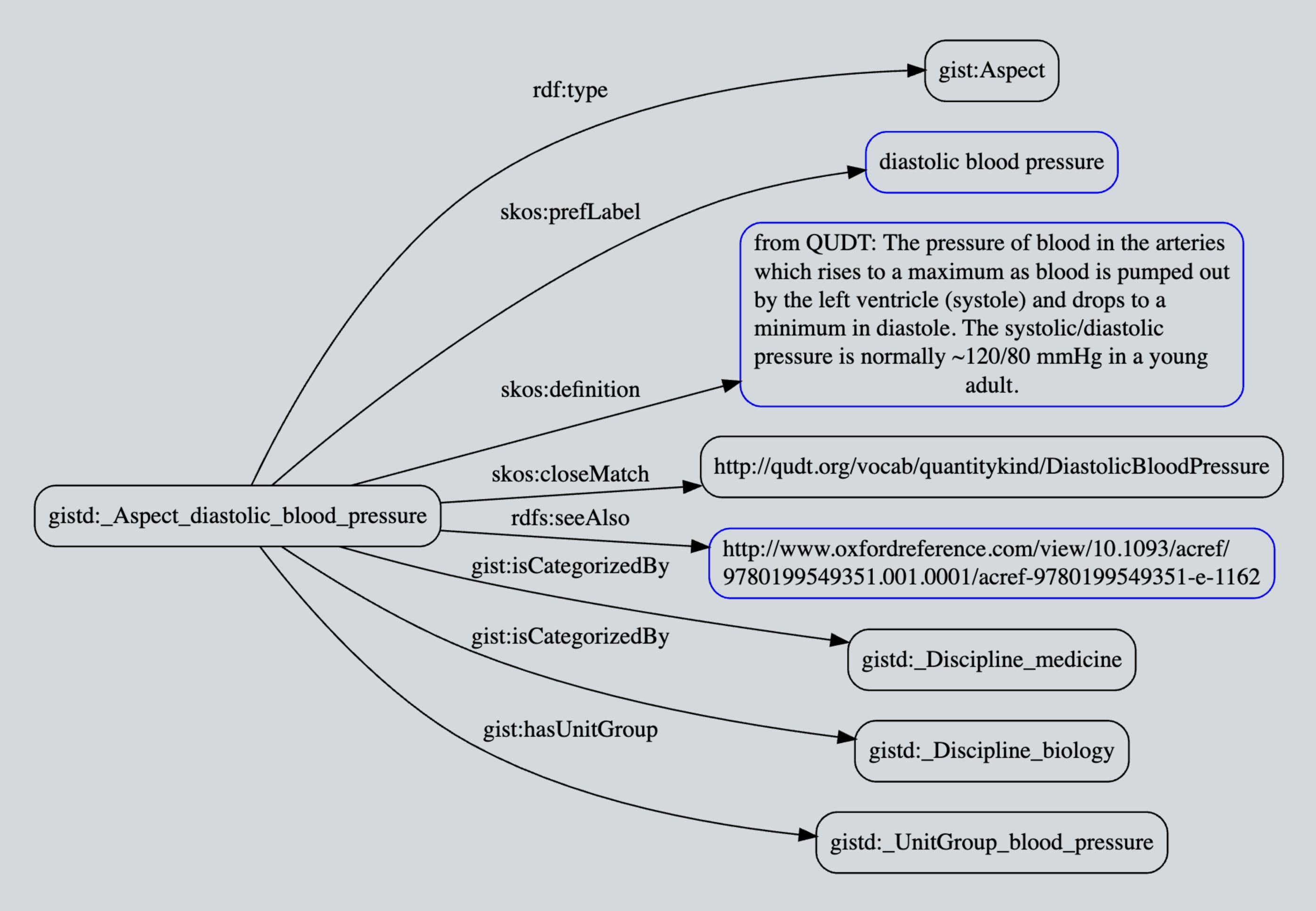
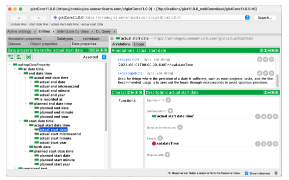
A clever ontological detail not shown here: A temporal relation such as “Mark supervises  Emma” must be gist:isConnectedTo a minimum of two objects — this cardinality is defined in the GIST ontology itself and is thus inherited. The result is data integrity managed by the semantic database itself! Additionally, you can see the richness of the GIST “at date time”  data properties most clearly in the expression of the hierarchical model in latest v11  ontology (see Protégé screenshot below). This allows the modeler to specify the precision of the start and end date times as well as distinguishing something that is “planned” vs. “actual”.  

Overall, a very flexible and extensible upper ontology that will meet most enterprises’  requirements.

Knowledge Graph Modeling: Time Series Micro-Pattern Using gist

Further, this overall micro-pattern, wherein we elevate relationships to first-class status, is infinitely re-purposable in a whole host of other governance and provenance modeling use cases that enterprises typically require. I urge you to explore and expand upon this simple  yet powerful pattern and leverage it for things other than time-series! 

One more thing… 

Given that with this micro-pattern we’ve essentially elevated relations to be first class citizens  — just like in classic Object Role Modeling (ORM) — we might want to consider also updating the namespaces of the subject/predicate/object domains to better reflect the objects and  roles. After all, this type of notation is much more familiar to developers. For example, the common notation object.instance is much more intuitive than owner.instance. As such, I  propose that the traditional/generic use of “ex:” as used previously should be replaced with  self-descriptive prefixes that can represent both the owner as well as the object type. This is good for readability and is self-documenting. And ultimately doing so may help developers become more comfortable with RDF/SPARQL over time. For example: 

  • ex:_MarkSupervisesEmma becomes rel:_MarkSupervisesEmma 
  • ex:supervisionBy becomes role:supervisionBy ex:_Mark becomes pers:_Mark
  • ex:_Mark becomes pers:_Mark 

Where

@prefix rel: <www.example.com/relation/>. 

@prefix role: <www.example.com/role/>. 

@prefix pers: <www.example.com/person/>.

Data-Centric: How Big Things Get Done (in IT)

Dave McComb

I read “How Big Things Get Done” when it first came out about six months ago.[1] I liked it then. But recently, I read another review of it, and another coin dropped. I’ll let you know what the coin was toward the end of this article, but first I need to give you my own review of this highly recommended book.

The prime author, Bent Flyvbjerg, is a professor of “Economic Geography” (whatever that is) and has a great deal of experience with engineering and architecture. Early in his career, he was puzzling over why mass transit projects seemed routinely to go wildly over budget. He examined many in great detail; some of his stories border on the comical, except for the money and disappointment that each new round brought.

He was looking for patterns, for causes. He began building a database of projects. He started with a database of 178 mass transit projects, but gradually branched out.

It turns out there wasn’t anything especially unique about mass transit projects. Lots of large projects go wildly over budget and schedule, but the question was: Why?

It’s not all doom and gloom and naysaying. He has some inspirational chapters about the construction of the Empire State Building, the Hoover Dam, and the Guggenheim Museum in Bilbao. All of these were in the rarified atmosphere of the less than ½ of 1% of projects that came in on time and on budget.

Flyvbjerg contrasted them with a friend’s brownstone renovation, California’s bullet train to nowhere, the Pentagon (it is five-sided because the originally proposed site had roads on five sides), and the Sydney Opera House. The Sydney Opera House was a disaster of such magnitude that the young architect who designed it never got another commission for the rest of his career.

Each of the major projects in his database has key considerations, such as original budget and schedule and final cost and delivery. The database is organized by type of project (nuclear power generation versus road construction, for instance). The current version of the database has 38,000 projects. From this database, he can calculate the average amount projects run over budget by project type.

IT Projects

He eventually discovered IT projects. He finds them to be among the most likely projects to run over budget. According to his database, IT projects run over budget by an average of 73%. This database is probably skewed toward larger projects and more public ones, but this should still be of concern to anyone who sponsors IT projects.

He described some of my favorites in the book, including healthcare.gov. In general, I think he got it mostly right. Reading between the lines, though, he seems to think there is a logical minimum that the software projects should be striving for, and therefore he may be underestimating how bad things really are.

This makes sense from his engineering/architecture background. For instance, the Hoover Dam has 4.3 million cubic yards of concrete. You might imagine a design that could have removed 10 or 20% of that, but any successful dam-building project would involve nearly 4 million cubic yards of concrete. If you can figure out how much that amount of concrete costs and what it would take to get it to the site and installed, you have a pretty good idea of what the logical minimal possible cost of the dam would be.

I think he assumed that early estimates for the cost of large software projects, such as healthcare.gov at $93 million, may have been closer to the logical minimum price, which just escalated from there, to $2.1 billion.

What he didn’t realize, but readers of Software Wasteland[2] as well as users of healthsherpa.com[3] did, was that the actual cost to implement the functionality of healthcare.gov is far less than $2 million; not the $93 million originally proposed, and certainly not the $2.1 billion it eventually cost. He likely reported healthcare.gov as a 2,100% overrun (final budget of $2.1 billion / original estimate of $93 million). This is what I call the “should cost” overrun. But the “could cost” overrun was closer to 100,000% (one hundred thousand percent, which is a thousand-fold excess cost).

From his database, he finds that IT projects are in the top 20%, but not the worst if you use average overrun as your metric.

He has another metric that is also interesting called the “fat tail.” If you imagine the distribution of project overruns around a mean, there are two tails to the bell curve, one on the left (projects that overrun less than average) and one on the right for projects that overrun more than average. If overruns were normally distributed, you would expect 68% of the projects to be within one standard deviation of the mean and 94% within two standard deviations. But that’s not what you find with IT projects. Once they go over, they have a very good chance of going way over, which means the right side of the bell curve goes kind of horizontal. He calls this a “fat tail.” IT projects have the fattest tails of all the projects in his database.

IT Project Contingency

Most large projects have “contingency budgets.” That is an amount of money set aside in case something goes wrong.

If the average large IT project goes over budget by 73%, you would think that most IT project managers would use a number close to this for their contingency budget. That way, they would hit their budget-with-contingency half the time.

If you were to submit a project plan with a 70% contingency, you would be laughed out of the capital committee. They would think that you have no idea how to manage a project of this magnitude. And they would be right. So instead, you put a 15% contingency (on top of the 15% contingency your systems integrator put in there) and hope for the best. Most of the time, this turns out badly, and half the time, this turns out disastrously (in the “fat tail” where you run over by 447%). As Dave Barry always says, “I am not making this up.”

Legacy Modernization

These days, many of the large IT projects are legacy modernization projects. Legacy modernization means replacing technology that is obsolete with technology that is merely obsolescent, or soon to become so. These days, a legacy modernization project might be replacing Cobol code with Java.

It’s remarkable how many of these there are. Some come about because programming languages become obsolete (really it just becomes too hard to find programmers to work on code that is no longer padding their resumes). Far more common are vendor-forced migrations. “We will no longer support version 14.4 or earlier; clients will be required to upgrade.”  What used to be an idle threat is now mandatory, as staying current is essential in order to have access to zero-day security patches.

When a vendor-forced upgrade is announced, often the client realizes this won’t be as easy as it sounds (mostly because the large number of modifications, extensions, and configurations they have made to the package over the years are going to be very hard to migrate). Besides, having been held hostage by the vendor for all this time, they are typically ready for a break. And so, they often put it out to bid, and bring in a new vendor.

What is it about these projects that are so rife? Flyvbjerg touches on it in the book. I will elaborate here.

Remember when your company implemented its first payroll system? Of course you don’t, unless you are, like, 90 years old. Trust me, everyone implemented their first automated payroll system in the 1950s and 1960s (so I’m told, I wasn’t there either). They implemented them with some of the worst technology you can imagine. Mainframe Basic Assembler Language and punched cards were state of the art on some of those early projects. These projects typically took dozens of person years (OK, back in those days they really were man years) to complete. This would be $2-5 million at today’s wages.

These days, we have modern programming languages, tools, and hardware that is literally millions of times more powerful than what was available to our ancestors. As such, a payroll system implementation in a major company is a multi-hundred million undertaking these days. “Wait, Dave, are you saying that the cost of implementing something as bog standard as a payroll system has gone up a factor of 100, while the technology used to implement it has improved massively?” Yes, that is exactly what I’m saying.

To understand how this could be you might consult this diagram.

This is an actual diagram from a project with a mid-sized (7,000-person) company. Each box represents an application and each line an interface. Some are APIs, some are ETLs, and some are manual. All must be supported through any conversion.

My analogy is with heart transplantation. Any butcher worth their cleaving knife could remove one person’s heart and put in another in a few minutes. That isn’t the hard part. The hard part is keeping the patient alive through the procedure and hooking up all those arteries, veins, nerves, and whatever else needs to be restored. You don’t get to quit when you’re half done.

And so it is with legacy modernization. Think of any of those boxes in the above diagram as a critical organ. Replacing it involves reattaching all those pink lines (plus a bunch more you don’t even know are there).

DIMHRS was the infamous DoD project to upgrade their HR systems. They gave up with north of a billion dollars invested when they realized they likely only had about 20% of the interfaces completed and they weren’t even sure what the final number would be.

Back to Flyvbjerg’s Book

We can learn a lot by looking at the industries where projects run over the most and run over the least. The five types of projects that run over the most are:

  • Nuclear storage
  • Olympic Games
  • Nuclear power
  • Hydroelectric dams
  • IT

To paraphrase Tolstoy, “All happy projects are alike; each unhappy project is unhappy in its own way.”

The unhappiness varies. The Olympics is mostly political. Sponsors know the project is going to run wildly over, but want to do the project anyway, so they lowball the first estimate. Once the city commits, they have little choice but to build all the stadiums and temporary guest accommodations. One thing all of these have in common is they are “all or nothing” projects. When you’ve spent half the budget on a nuclear reactor, you don’t have anything useful. When you have spent 80% of the budget and the vendor tells you you are half done, you have few choices other than to proceed. Your half a nuclear plant is likely more liability than asset.


Capital Project Riskiness by Industry [4]

And so it is with most IT projects. Half a legacy modernization project is nothing.

Now let’s look at the bottom of Flyvbjerg’s table:

  • Roads
  • Pipelines
  • Wind power
  • Electrical transmission
  • Solar power

Roads. Really? That’s how bad the other 20 categories are.

What do these have in common? Especially wind and solar.

They are modular. Not modular as in made of parts, even nuclear power is modular in some fashion. They are modular in how their value is delivered. If you plan a wind project with 100 turbines, then when you have installed 10, you are generating 10% of the power you hoped the whole project would. You can stop at this point if you want (you probably won’t as you’re coming in on budget and getting results).

In my mind, this is one reason I think wind and solar are going to outpace most predictions of their growth. It’s not because they are green, or even that they are more economical — they are — but they are also far more predictable and lower risk. People who invest capital like that.

Data-Centric as the Modular Approach to Digital Transformation

That’s when the coin dropped.

What we have done with data-centric is create a modular way to convert an enterprise’s entire data landscape. If we pitched it as one big monolithic project, it would likely be hundreds of millions of dollars, and by the logic above, high risk and very likely to go way over budget.

But instead, we have built a methodology that allows clients to migrate toward data-centric one modest sized project at a time. At the end of each project, the client has something of value they didn’t have before, and they have convinced more people within their organization of the validity of the idea.

Briefly how this works:

  • Design an enterprise ontology. This is the scaffolding that prevents subsequent projects from merely re-platforming existing silos into neo-ilos.
  • Load data from several systems into a knowledge graph (KG) that conforms to the ontology in a sandbox. This is nondestructive. No production systems are touched.
  • Update the load process to be live. This does introduce some redundant interfaces. It does not require any changes, but some additions to the spaghetti diagram (this is all for the long-term good).
  • Grow the domain footprint. Each project can add more sources to the knowledge graph. Because of the ontology, the flexibility of the graph and the almost free integration properties of RDF technology, each domain adds more value, through integration, to the whole.
  • Add capability to the KG architecture. At first, this will be view-only capability. Visualizations are a popular first capability. Natural language search is another. Eventually, firms add composable and navigable interfaces, wiki-like. Each capability is its own project and is modular and additive as described above. If any project fails, it doesn’t impact anything else.
  • Add live transaction capture. This is the inflection point. Up to this point, the project was a richer and more integrated data warehouse. Up to this point, the system relied on the legacy systems for all the information, much as a data warehouse does. At this junction, you implement the ability to build use cases directly on the graph. These use cases are not bound to each other in the way that monolithic legacy system use cases are. These use cases are bound only to the ontology and therefore are extremely modular.
  • Make the KG the system of record. With the use case capability in place, the graph can become the source system and system of record for some data. Any data sourced directly in the graph no longer needs to be fed from the legacy system. People can continue to update it in the legacy system if there are other legacy systems that depend on it, but over time, portions of the legacy system will atrophy.
  • Legacy avoidance. We are beginning to see clients who are far enough down this path that they have broken the cycle of dependence they have been locked into for decades. The cycle is: If we have a business problem, we need to implement another application to solve it. It’s too hard to modify an existing system, so let’s build another. Once a client starts to get to critical mass in some subset of their business, they begin to become less eager to leap into another neo-legacy project.
  • Legacy erosion. As the KG becomes less dependent on the legacy systems, the users can begin partitioning off parts of it and decommissioning them a bit at a time. This takes a bit of study to work through the dependencies, but is definitely worth it.
  • Legacy replacement. When most of the legacy systems data is already in the graph, and many of the use cases have been built, managers can finally propose a low-risk replacement project. Those pesky interface lines are still there, but there are two strategies that can be used in parallel to deal with them. One is to start the furthest downstream, with the legacy systems that are fed, but do little feeding of others. The other strategy is to replicate the interface functionality, but from the graph.

We have done dozens of these projects. This approach works. It is modular, predictable, and low-risk.

If you want to talk to someone about getting on a path of modular modernization that really works, look us up.

The New Gist Model for Quantitative Data

Phil Blackwood

Every Enterprise can benefit from having a simple, standard way to represent quantitative data. In this blog post, we will provide examples of how to use the new gist model of quantitative data released in gist version 13. After illustrating key concepts, we will look at how all the pieces fit together and provide one concrete end-to-end example.

Let’s examine the following:

  1. How is a measurement represented?
  2. Which units can be used to measure a given characteristic?
  3. How do I convert a value from one unit to another?
  4. How are units defined in terms of the International System of Units?

First, we want to be able to represent a fact like:

“The patio has an area of 144 square feet.”

The area of the patio is represented using this pattern:

… where:

A magnitude is an amount of some measurable characteristic.

An aspect is a measurable characteristic like cost, area, or mass.

A unit of measure is a standard amount used to measure or specify things, like US dollar, meter, or kilogram.

Second, we need to be able to identify which units are applicable for measuring a given aspect. Consider a few simple examples, the aspects distance, energy, and cost:

For every aspect there is a group of applicable units. For example, there is a group of units that measure energy density:

… where:

A unit group is a collection of units that can be used to measure the same aspect.

A common scenario is that we want to validate the combination of aspect and unit of measure. All we need to do is check to see if the unit of measure is a member of the unit group for the aspect:

Next, we want to be able to convert measurements from one unit to another. A conversion like this makes sense only when the two units measure the same aspect. For example, we can convert pounds to kilograms because they both measure mass, but we can’t convert pounds to seconds. When a conversion is possible, the rule is simple:

There is an exception to the rule above for units of measure that do not have a common zero value. For example, 0 degrees Fahrenheit is not the same temperature as 0 degrees Kelvin.

To convert from Kelvin to Fahrenheit, reverse the steps: first divide by the conversion factor and then subtract the offset.

To convert a value from Fahrenheit to Celsius, first use the conversion above to convert to Kelvin, and then convert from Kelvin to Celsius.

Next, we will look at how units of measure are related to the International System of Units, which defines a small set of base units (kilogram, meter, second, Kelvin, etc.) and states:

Notice that every expression on the right side is a multiple of kilogram meter2 per second3. We can avoid redundancy by “attaching” the exponents of base units to the unit group. That way, when adding a new unit of measure to the unit group for power there is no need to re-enter the data for the exponents.

The example also illustrates the conversion factors; each conversion factor appears as the initial number on the right hand side. In other words:

The conversion factors and exponents allow units of measure to be expressed in terms of the International System of Units, which acts as something of a Rosetta Stone for understanding units of measure.

One additional bit of modeling allows calculations of the form:

(45 miles per hour) x 3 hours = 135 miles

To enable this type of math, we represent miles per hour directly in terms of miles and hours:

Putting the pieces together:

Here is the standard representation of a magnitude:

Every aspect has a group of units that can be used to measure it:

Every member of a unit group can be represented as a multiple of the same product of powers of base units of the International System of Units:

where X can be:

  • Ampere
  • Bit
  • Candela
  • Kelvin
  • Kilogram
  • Meter
  • Mole
  • Number
  • Other
  • Radian
  • Second
  • Steradian
  • USDollar

Every unit of measure belongs to one or more unit groups, and if can be defined in terms of other units acting as multipliers and divisors:

We’ll end with a concrete example, diastolic blood pressure.

The unit group for blood pressure is a collection of units that measure blood pressure. The unit group is related to the exponents of base units of the International System of Units:

Finally, one member of the unit group for blood pressure is millimeter of mercury. The scope note gives an equation relating the unit of measure to the base units (in this case, kilogram, meter, and second).

The diagrams above were generated using a visualization tool. The text version of the diagrams is:

For more examples and some basic queries, visit the gitHub site gistReferenceData.

In closing, we would like to acknowledge the re-use of concepts from QUDT, namely:

  • every magnitude has an aspect, via the new gist property hasAspect
  • aspects are individuals instead of categories or subclasses of Magnitude as in gist 12
  • exponents are represented explicitly, enabling calculations